When I recently commended a particular online discussion tool in response to a query on the Forma Facebook Group, a friend noted “I wish it was a little prettier. But that’s the curmudgeon in me.”
I contend that you don’t have to be a curmudgeon to want learning tools to be beautiful. No less an educational authority than Maria Montessori put it this way:
“Another character of the objects is that they are attractive. Colour, brightness and harmony of form are sought after in everything which surrounds the child. Not only the sensorial material, but also the environment is so prepared that it will attract [them], as in Nature brilliant petals attract insects to drink the nectar which they conceal.
“‘Use me carefully,’ say the clean, polished tables; ‘Do not leave me idle,’ say the little brooms with their handles painted with tiny flowers; ‘Dip your little hands in here,’ say the wash basins, so clean and ready with their soap and bubbles.”
If you can read that bit about the broom handles without going a little watery … well, you might just need some more beauty in your life.
My work on Creative Commons Prayer has been largely motivated by the growing importance of art and music to my own spirituality. I suspect working at St. Michael’s Church has had something to do with that, but so has studying with so many gifted designers and media makers.
And the truth is, many of our educational resources, especially free ones, are drab at best, and downright alienating at worst.
Stock photo collections have been a mixed blessing in this regard. Sure, it’s easy to get photos, including free ones, that are individually gorgeous. But as many commentators have noted, together they have too often had an ugly side effect: reinforcing white supremacy by excluding the experience of people of color.
We can do better in this respect by searching for Creative Commons photos on a site like Flickr, but some projects do not lend themselves to required media attribution.

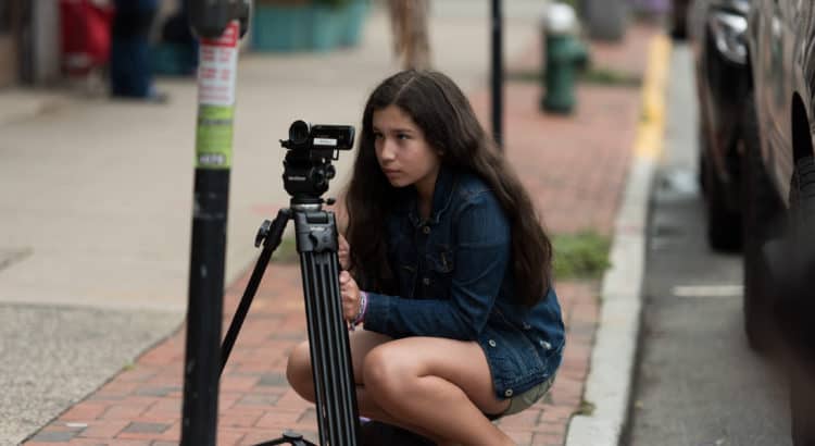
Photo by Haley Rivera on Unsplash
I thought about representation a lot as I was working on my Holy Eucharist Illuminated teaching cards. I didn’t do as well as I wanted to, but I think I did way better than I would have been able to even just a couple of years ago.
That’s partly because I continue to get a better handle on the limitations of my particular experience as a white, ordained man, and partly because the libraries are getting better.
Free stock photo sites like Unsplash and Pixabay are slowly getting more diverse in their racial and cultural representation. I assume that’s partly because of small-but-growing collections like Nappy (and others), which are tackling the problem more head on and whose photos I’m starting to see show up on the bigger sites.
I also think questions of representation and equity are slowly starting to loom a little larger on (white) creators’ minds. (Emphasis on slowly—see, for example, Season 7 of Gimlet’s StartUp Podcast, which chronicles both the successes and the grueling struggles of Backstage Capital founder Arlan Hamilton.)
I say all this with two explicit intentions in mind:
(1) To challenge us all to attend to the aesthetic dimensions of the work we do. I’m coming away from my most recent resource development experience more convinced than ever of this need. Beautiful learning tools and experiences help us learn better.
(2) To remind those of us likely to need reminding that with the great power of stock photo libraries and the like comes the great responsibility to be thoughtful and critical about how we select and deploy them. Our efforts to make media worthy of the best of our traditions will fall short if we don’t continually challenge ourselves to capture the full range of beauty represented in our whole human family.
Cover photo by Erik-Jan Leusink on Unsplash

